The power is off in Northern California but we want to get this out even though it is still in draft form. We are working off desk and not sure when power will be restored. Take this as our first cut or swing in one of four at-bats.
Summary
– We analyze the various components of the household balance sheet that drove net worth for the different percentile groups from Q1 2000 to Q1 2019– The Top 1% are the ownership class, who hold over 60 percent of their assets in equity, in both public and non-corporate business and benefited greatly from QE– The Bottom 50% of households have not benefited from the great asset inflation of the past ten years as their debt liabilities have exceeded the 93 percent growth in assets, resulting in an 8.6 percent decline in net worth from Q1 2000 to Q1 2019– This post is a work in progress. Stay tuned for further updates when they turn the power back on in Northern California
In keeping our commitment we made to GMM readers in the post, America’s Perilous Path Of Wealth Distribution, we have another follow-up with some additional and very interesting data on wealth distribution in the United States. If you haven’t read our previous posts, run don’t walk for some deep background to this piece. Here are the links, America’s Perilous Path Of Wealth Distribution and Wealth Distribution In America
Review
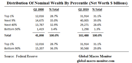
In the previous posts, we illustrated America’s growing wealth gap, where the the Top 1% of households now hold more wealth than the Bottom 90%. The Top 1% are households with a net worth north of around $11-12 million. We use the terms wealth and net worth interchangeably.
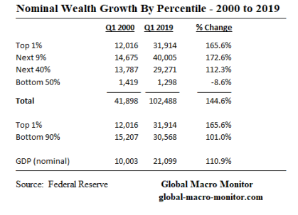
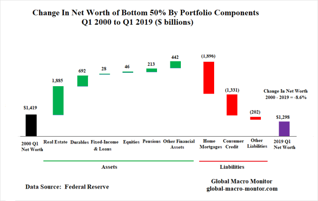
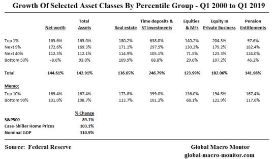
Wealth distribution in America is even more acute when comparing the 165.6 percent growth of the net worth for the Top 1% relative to the stunning 8.6 percent decline of the Bottom 50% of households. Yes, you read that correct, the aggregate nominal wealth of the Bottom 50% of American households has fallen almost 10 percent over the past 20 years, which is politically destabilizing and explains much of the conflict in today’s body politic.
In this post, we look at the composition of wealth by asset class and the contribution each has had to the change to the net worth for each percentile group from Q1 2000 to Q1 2019.
Stock Versus Flows
We only look at the change in the stock of assets and liabilities for each household percentile group, which includes the combination of capital gains, the cumulative income from assets, and the accumulation of new asset purchases with savings out of income. The data is not easily available to breakout the later, so keep in perspective the data includes capital appreciation, asset income, and the accumulated flow of new savings from income over the years. That is the absorption of cumulative savings and thus implicit income growth over the time period.
The above complicates our wealth distribution analysis as households can move from, say, the Bottom 50% to the Top 1% by hitting the lottery, for example. In a more real-life example, one of my daughter’s classmates who was a first-round pick in the recent Major League Baseball draft woke up one morning as a starving college student and went to bed that night with a $7.8 million contract, including a huge signing bonus. Definitely, a meteoric rise from the Bottom 10% to the Top 10%, assuming he and his girlfriend are counted as a household by the Census Bureau.
Income, savings, and the allocation of savings matter big to wealth accumulation. What matters even more is building and maintaining wealth.
Liabilities
Since liabilities also play a role in determining net worth, we also have a brief look at household liabilities.
How The Rich Got Richer
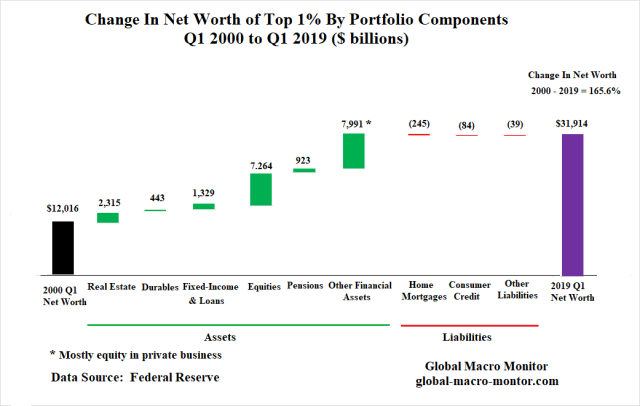
The following chart illustrates the aggregate nominal wealth of the Top 1% of households increased by $20 trillion, 165.6%, from $12 trillion in Q1 2000 to $32 trillion in Q1 2019. Most of the increase, 60.6 percent, came from the appreciation and accumulation of public equities and equity in non-corporate private business: $7 trillion and $4.7 trillion, respectively.
Real estate holdings accounted for 11.6 percent of the change in net worth and fixed-income assets 6.7 percent.
Impact of QE
How much of the Top 1%’s increase in wealth was due to the Fed’s monetary policy of quantitative easing (QE)? We can’t really quantify at this moment and will leave it for a future analysis but it is fairly safe to say, a lot. The Top 1% have effectively become asset surfers riding QE to unfathomable riches!
Is it any wonder why support is increasing for a People’s QE?
Liabilities
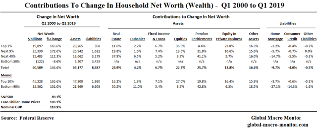
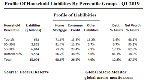
The Top 1% of households carry very little debt, less than 2 percent of total assets.
Contributions To Net Worth By Household Percentile Group
How The Poor Got Poorer
Though the assets of the Bottom 50% of households increased by $3.3 trillion, or 93 percent, over the period, the group’s net worth still fell by almost 10 percent because of their change in debt liabilities exceeded the increase in assets.
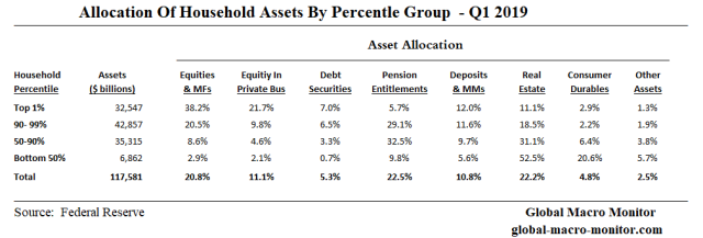
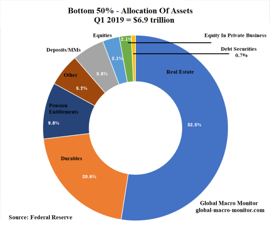
Almost 80 percent of the $3.3 trillion increase in assets was in real estate and consumer durables, such as cars, which illustrates just how little the Bottom 50% are invested in the financial markets. Only 2.9 percent of the group’s assets are held in equities and 9.8 percent in pension entitlements (see Asset Allocation chart below).
Liabilities And The Dusenberry Effect
Some of the increase in liabilities over the period was student loans, which we believe, are included in consumer debt.
We were surprised to find that even at the apex of the housing bubble, when the value real estate assets of the lower 50% were growing double digits, aggregate net worth was declining as the group’s borrowing exceeded asset growth. We suspect it was due to leveraging and using their home equity to finance additional purchases of homes and/or using it as an ATM to finance consumption. Moreover, the toxic mortgage debt that was marketed to the lower-income groups also played a role, such as 12o percent mortgages and option ARMs.
Stagnant Real Wages
Just a quick note on relative real wage growth from 1979 to 2018 from the Congressional Research Service (CRS),
Real wages rose at the top of the distribution, whereas wages stagnated or fell at the middle and bottom. Real (inflation-adjusted) wages at the 90th percentile increased over 1979 to 2018 for the workforce as a whole and across sex, race, and Hispanic ethnicity. However, at the 90th percentile, wage growth was much higher for white workers and lower for black and Hispanic workers. By contrast, middle (50th percentile) and bottom (10th percentile) wages grew to a lesser degree (e.g., women) or declined in real terms (e.g., men). – CRS
We also suspect declining real incomes in a large portion of the Bottom 50% of households resulted in the Dusenberry Effect, where households took on more debt to sustain a fleeting standard of living,
One part of the “Dusenberry Effect” basically states that consumers do not give up their consumption patterns very easy even if their incomes decline. They, in effect, “ratchet” down their living standard very slowly by first having a second wage earner enter the workforce as we saw in the 1970’s when women began to enter the workforce en masse and then by taking on debt to finance their previous standard of living. — GMM, August 2017
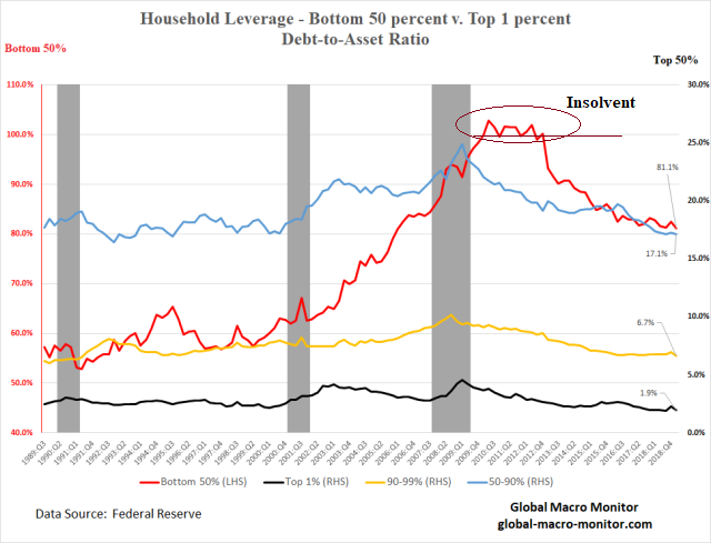
Whatever the case, the Bottom 50% carry a huge relative debt burden, 81.1 percent of assets, compared the 17.1 percent of the households in 50-90% percentile, the next most indebted group.
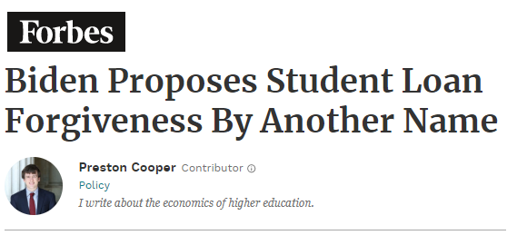
The data also clearly illustrates why debt forgiveness is a major focus of today’s populist message, even among the so-called moderate presidential candidates.
Democratic presidential frontrunner Joe Biden laid out his higher education platform today. There’s a lot in there, but I want to focus on one part: his proposal to make the income based-repayment (IBR) program for federal student loans more generous by cutting payments to just 5% of discretionary income.
When The Bottom 50% Was Insolvent
In an earlier post, we showed how the Bottom 50%, on an aggregate basis (i.e., not every household) was insolvent during several quarters just after the financial crisis. Interestingly, we found what initially brought the percentile group back above water was a sharp reduction in its liabilities, which we suspect was getting out from under their bad mortgage debt either through foreclosures or debt forgiveness programs.
Household Allocation Of Assets
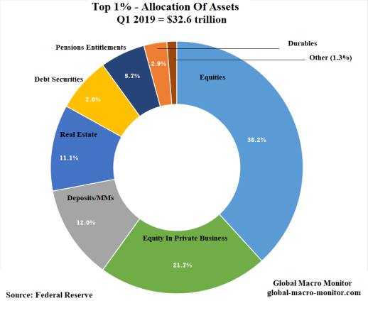
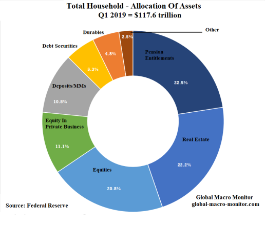
We leave you with the following data on how each percentile group’s assets are allocated. When the power comes back off we’ll have more commentary.
Main Observations
– The Top 1% are the ownership class, holding 60 percent of their assets in equities and equity in non-corporate businesses– Pension entitlements make up almost 30% of the assets of the 90-99% percentile of households with 40% of their assets allocated to equities and real estate holdings– The 50-90% percentile group hold almost two thirds of their assets in pensions and real estate with only 8.6 percent held in equities– More than 70 percent of the Bottom 50% assets are held in real estate and consumer durables, such as autos, and only 2.9% in equities
Growth Of Asset Holdings
Interesting that the net worth of the top three percentiles outpaced the S&P500 and the Case-Shiller national home price index. This clearly reflects the accumulation of assets through savings. Also interesting the outsize growth of short-term assets by the Top 10%, which partially reflects the start date was the March 2000 peak of the dot.com bubble and the latest news that the rich are now hoarding cash.
Upshot
It’s coming in the final print. Stay tuned.
No comments:
Post a Comment
Note: Only a member of this blog may post a comment.