And why one feature is better than two or three.
Uber did not allow you to pre-book a taxi. Amazon started out by selling books only. Google was just a search engine. McDonald’s got rid of cutlery. And somehow we still believe that for a product to be successful it must do many things.
There are usually two cases — new products trying to convince the market that they are worth it and companies with established products that offer more than needed.
A big mistake new companies do is trying to offer everything their competitors have, believing this way they will attract more interest and gain customers. And on the other side, established companies which believe that more products and resources spent will always result in better results. So I would like to show you why offering too much is a psychological problem and how new products can nail it by focusing on one thing they are good at.
For new products you have to change behaviour first
As we might know, humans are creatures of habits. And if we already have well-established patterns, and most of the times we do, it will be hard for a new company to convince us that we must buy their “innovative product” or make a switch to something else.
We can call a product "innovation" when it changes people's habits. For example, the iPhone is an innovation. So for your product to become a habit, it has to do a straightforward thing but do it great. Why? Because it is much easier to adopt a new technology if the learning curve is low and the reward is high for what it does.
The temptation is always there for manufacturers to add functionality to things — since conventional logic suggests that more must be better. What takes real genius is to leave things out — Rory Sutherland
Back in 2006, McDonald’s saw its growth stall. The fast-food chain decided that the problem was its limited menu, so it tried out many new items and ended up doubling the offerings. But sales hardly budged. Finally, in 2016, it took a new track. It went back to basics, dropped most of those additional items, and instead extended its popular breakfast offerings. Sales finally jumped, with same-store revenue up 6% in 2017, and the stock rose by 40% —
Tiffani Bova, HBR

The learning curve must be low
To change a behaviour, it easier done if the learning curve of your product is low. As I wrote in a previous article — 10 Small Design Mistakes We Still Make — if we find something that does the job, and does it great, we will almost never make a switch to another service or product, even if it is a little bit better. Why? It’s in our nature to stay with the familiar and we don’t like taking risks of learning something only to realise it is not something we needed.
Once a person nails down the use of your product, they will rarely switch to something else.
How to make the learning curve lower? User metaphors.
People learn faster when an app’s interface and actions are metaphors for familiar experiences. The experiences may come from the digital or real world. Metaphors work well in because people interact with the screen. They move views out of the way to expose content beneath. They drag and swipe content. People toggle switches, move sliders, and scroll through picker values.
Always try to learn what other apps are your core customers using on a daily basis. This will allow to design similar experiences and remove any friction or create uncomfortable learning situations.
Choice overload
Another reason why many products fail or companies can’t get new users is because they offer too many options — features, services or products. And by overwhelming your users with too much stuff, people will always choose to stick with what works currently for them or choose not to buy anything else. This process is called overchoice or choice overload.
Choice overload is a cognitive process in which people have a difficult time making a decision when faced with many options — Wikipedia
The phenomenon of overchoice occurs when many similar choices are available. Making a decision becomes overwhelming due to the many potential outcomes and risks that may result from making the wrong choice. Having too many approximately equally good options is mentally draining because each option must be weighed against alternatives to select the best one. This can be easily seen and experienced when you buy, literally, anything for your house (dishwasher, microwave, washing machine, vacuum, etc.)

When Nike called Apple
You can fit all Apple’s products on a table, and it still surpassed Google as the most valuable company on the planet. How is that possible? They had a well-established philosophy that almost never changed — get rid of crappy stuff. Moreover, that philosophy helped Nike to become one of the greatest brands alongside Apple too. When Mark Parker became the CEO of Nike, he had a phone call with Steve Jobs and asked him:
“Do you have any advice?” Parker asked Jobs. “Well, just one thing,” said Jobs. “Nike makes some of the best products in the world. Products that you lust after. But you also make a lot of crap. Just get rid of the crappy stuff and focus on the good stuff.” Jobs paused and Parker filled the quiet with a chuckle. But Jobs didn’t laugh. He was serious. “He was absolutely right,” said Parker. “We had to edit.” — Source: Forbes.
How Apple does it
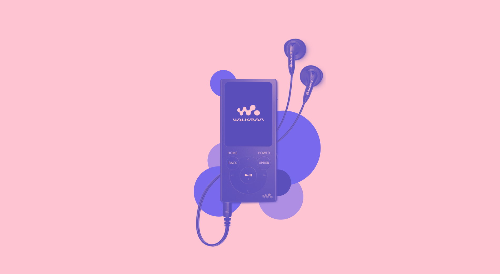
Apple doesn’t invent a new product or product category. Almost all the time, all of Apple’s products have been recreations of existing products. Apple did not invent the MP3 player (Walkman), the smartphone (Ericsson R380), the tablet (Microsoft). Instead, Apple reinvented all of them and made them better.
Our goals are very simple — to design and make better products. If we can’t make something that is better, we won’t do it — Jonathan Ive, Chief Design Officer of Apple
When you do one thing but great, you add an extra drop of confidence and loyalty into your customer’s heart. This way, when you launch every year a better product, it becomes harder for the customer to make a switch because you earned their trust in doing one but a great thing.
Good is the enemy of great. And that is one of the key reasons why we have so little that becomes great. We don’t have great schools, principally because we have good schools. We don’t have great government, principally because we have good government. Few people attain great lives, in large part because it is just so easy to settle for a good life― Jim Collins
Minimise the decision-making process
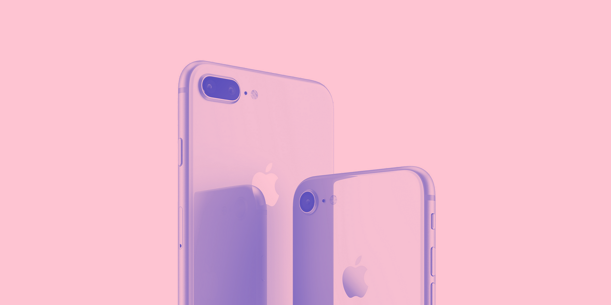
Another reason why Apple is so successful is that it has only one product in its category. It minimises the decision-making process for the consumer by making things simple.
Apple doesn’t have five iPhone models to choose from. It has only one — this year’s latest version. What about additional choice? Very simple — big or small. In case you don’t have the budget you can always buy the previous models with the same thinking model. And while this may seem to limit the company’s potential, given the number of smartphones available on the market, the truth is the reverse.
Time’s magazine did a consumer research for over 30 years, in which consumers constantly tell them that while choice is nice, in reality, people want the process of choosing a tech product to be simple and not complicated.
How Walkman did it
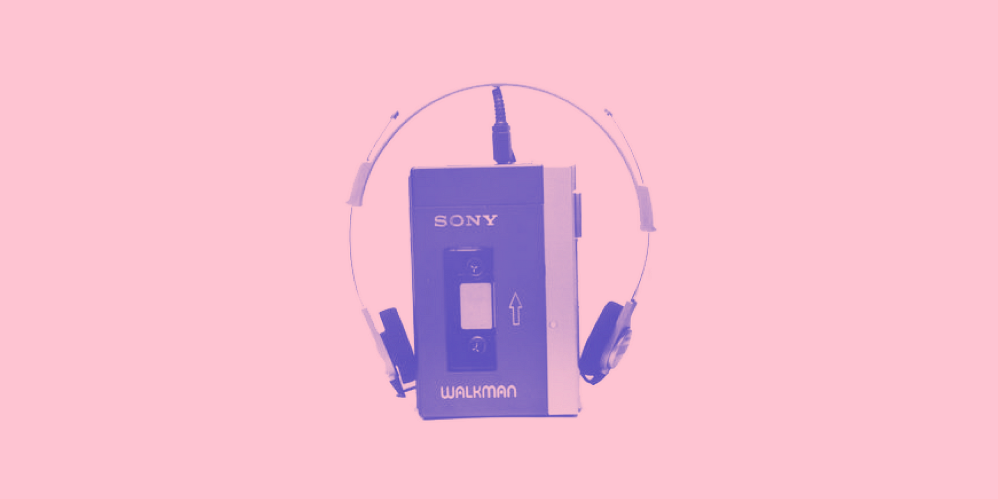
Akio Morita, with his business partner Masaru Ibuka, founded Sony in 1946. Large magnetic tape recorders were the company’s first area of focus, later followed by the first pocket radio. But perhaps his most significant moment of genius involved the creation of the Sony Walkman, the ancestor of the iPod.
In market research, the Walkman aroused very little interest and quite a lot of hostility. ‘Why would I want to walk about with music playing in my head?’ was a typical response. Morita ignored this.
How was the idea of Walkman born?
The request for the Walkman had initially come from the 70-year-old Ibuka, the honorary chairman of Sony at that time. Ibuka wanted a small device that would allow him to listen to a full-length opera on his many flights between Tokyo and the US.
Morita asked Sony’s engineers to work on the idea, and they succeeded in achieving what he had briefed them to create — a miniature stereo cassette-player. But they also had managed to include a recording function in the Walkman. However, Morita told them to remove it.
Now, why would you remove a feature that costs an insignificant amount of resources and adds a trivial amount to the final price? Sony’s engineers recommended going with a microphone and recorder because it would add value to the final product. This also means more ways to use the Walkman for.
But Morita argued that a recorder would only confuse the end consumer. “For what is this device? Dictation? Should I record live music? Should I take interviews with it? Should I record my vinyl?”
By narrowing the perceived uses of the device, Sony ensured that the device could do only one thing: listen to music. This way it would be easier for people to adopt a new behaviour, since there was only one thing to adopt. This way you can also understand why the iPods became so popular too.

How others do it
On the other side, giving examples of big brands like Apple, Sony and McDonald’s is easy when they are already prominent and successful, but there are also small companies that started with one feature only and are doing great. A company I admire, Bonsai — a tool for freelancers to send proposals & invoices, contracts, track expenses and projects — is a perfect example.
How did the company start? When they launched for the first time on Product Hunt I remember only one thing they promised — send beautiful and bullet proof contracts. Because of that, many people were attracted to the product. Not too many companies offered the ability to send designer like contracts. Also, it was a core problem that most freelancers were and are struggling with.
So what about them now? With time and patience they have become an all in one solution for freelancers. Starting small and perfecting a feature allowed this company to grow into what they are now today. And you can see that it was easy for early adopters to use the tool because the learning curve was low — only one feature. And once people got used to the product, it became easier to adopt other features too and make the switch entirely.

The philosophy of simplicity
This philosophy of keeping it simple is applied not only to a product’s features, or how many products your company sells. This type of thinking applies to everything. From the way you do business to they way you think. It’s not that you decide one day to cut down useless features of your product to only one and suddenly the sales will skyrocket. To achieve that type of simplicity, you have to know what is or are the biggest needs of your customers and not deviate from your goal with useless noise.
Growth is best achieved by making things simpler for your customer rather than for you — Tiffani Bova
No comments:
Post a Comment
Note: Only a member of this blog may post a comment.